Creating Effective Patient Education Materials
by Tiffany Vo, MPH, CHES
It’s typical for healthcare professionals to create patient education materials. This means that most people making these items are nurses, doctors, administrators, or health educators. These individuals are often highly educated, with a vast understanding of medical language.
As a result, many of the patient education materials I’ve seen in my 10-plus years in education are text-heavy, have complex word choices, and are not easy for patients to understand. Yet materials for patients should be written at a 6th grade reading level or below.
Most patients and families are overwhelmed by a new diagnosis, progressive chronic issue, or anxiety about being in the clinical setting. They don’t need 20 page-long, text-heavy documents with the longest instructions ever, scary warning messages, and disclaimers in a language they don’t fully understand (medical terminology being its own unique and, at times, complex language).
So how can we create effective patient education materials?
Understand Health Literacy Guidelines and Objectives
The process starts with understanding health literacy guidelines and objectives. Let’s look at a few important ones.
Plain Language Guidelines. The Plain Writing Act of 2010 requires federal agencies to use clear communication that the public can understand and use. Thereafter, federal plain language guidelines were released for all federal agencies to follow.
These guidelines tell how to create materials that enable users to:
- Find what they need.
- Understand what they find.
- Use what they find to meet their needs.
Clear and Simple Guide. The National Institutes of Health created a predecessor of the federal plain language guidelines: the Clear and Simple guide.
This guide lists five steps for developing materials:
- Define the target audience.
- Conduct target audience research.
- Develop a concept for the product.
- Develop content and visual design features.
- Pretest and revise draft materials.
All of these steps, of course, should be geared toward your target audience.
Health Literacy Objectives in Healthy People 2030. Healthy People is an ongoing set of objectives developed each decade by the Office of Disease Prevention and Health Promotion. These objectives are public health priorities to help individuals, organizations, and communities in the United States improve health and well-being.
Healthy People 2030 includes a number of objectives that are related to improving health literacy. Indeed, improving health literacy is a key factor in achieving all Healthy People 2030 objectives. After all, if people don’t understand the health content being shared, how will they know how to address the objectives for 2030?
Use Health Literacy Guidelines and Objectives
Next, put these guidelines and objectives into practice. Patient education materials should be short, easy to understand, visually engaging, and (if you want patients to follow the instructions) fridge worthy. Yes, fridge worthy! And what’s the best and easiest form of fridge-worthy patient education materials? Infographics!
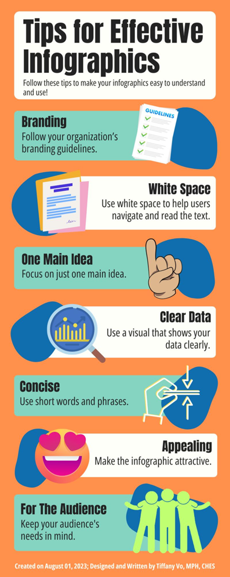
Tips for Effective Infographics. Here are some basic tips for making fridge-worthy infographics.

- Follow your organization’s branding guidelines. Many organizations, hospitals, and clinics have logos, texts, fonts, colors, themes, and other criteria that they may require you to follow. Check with your marketing team about your branding guidelines.
- Use white space. You don’t need to fill up your entire document. White space is good for easily navigating and reading through a document.
- Communicate one main idea. Having too many topics in one infographic makes the document too busy and harder for the reader’s eyes to follow.
- Clearly communicate your data. Think about what type of graph, table, or other creative visual can best display your data. Try to help the reader understand and grasp information quickly.
- Use short words and phrases. Your infographic does not need to have full sentences or paragraphs in all the sections. See where you can reduce your text while keeping the core information needed for your topic.
- Keep it cute. Yes, keep it attractive. Design and visuals are just as important as the text. This keeps the reader’s attention and accentuates the text. Be sure to tidy up your alignment, spacing, and other fine details.
- Design for your audience. Use a larger font for people with visual impairments. Use more animated design and images when creating for children. Use color theory to send a subconscious message to your audience. Use professional translations as needed for your patients.
Examples of Effective Infographics.
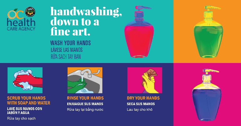
Finally, for your viewing pleasure, here are some examples of effective infographics.

Source: https://pbs.twimg.com/media/Ecls7oVU0AE0Exb?format=png&name=4096x4096

Source: https://www.sfcdcp.org/material/cover-your-cough/

Source: https://alliedhealth.llu.edu/sites/alliedhealth.llu.edu/files/docs/myplate-vegeterian-food-guide.pdf
About the Author

Tiffany Vo is Patient Education Coordinator at UCI Health and Owner of Lettuce Gather. She’s a plant-based health educator, advocate, and resource specialist who works to serve the community and improve health outcomes.
#IHABlog
#Education#PatientEducation